
Color Psychology in Home Decorating: A Room-by-Room Guide
Color Psychology in Home Decorating: A Room-by-Room Guide
Start with the feeling, not the paint chip
Ask what each room needs to help you do. A bedroom might call for winding down, while a living room needs to make conversation easy. Your home office may need fewer visual distractions; your kitchen might benefit from a cheerful start to the day. Those goals give you a better starting point than choosing a color because it is popular.
Color associations are useful inspiration, not guarantees. Personal taste and culture shape how we respond to a shade, while lighting and surrounding materials change how it appears. As Encyclopaedia Britannica’s overview of color explains, the color we perceive depends on light and visual perception. Keep a favorite rug, sofa, or piece of art in view as you choose: a palette is easier to build when it works with something you already enjoy.
Try a room-by-room starting point
Use these combinations as possibilities, not prescriptions. A muted blue can feel different from a vivid blue, just as creamy white differs from stark white.
- Bedroom: Try soft blue, warm white, and natural wood for a quieter feel. Start with bedding or a portable sample.
- Living room: Pair a warm neutral with muted green and small rust accents. Cushions are an easy place to experiment.
- Home office: Consider cream, subdued blue-green, and charcoal. Test the blue-green near your desk before using it more widely.
- Kitchen: Warm white, gentle yellow, and wood tones can make a cheerful combination. Introduce yellow through replaceable accents first.
Existing finishes count, too. Wood cabinetry may already bring warmth to a kitchen. If you are planning a living room around our 72″ Electric Fireplace TV Stand with Mantel, consider its finish alongside your flooring and upholstery when choosing wall and accent colors.
Featured in this guide
Color Psychology in Home Decorating | Digital Guide for Interior Design Inspiration, Mood-Boosting Color Schemes, and Room-by-Room Decorating Tips
Give each color a job
If your choices feel scattered, use 60/30/10 as a loose planning aid: a dominant color, a supporting color, and a smaller accent. In a bedroom, that might mean warm-white walls, blue textiles, and a few terracotta accessories. You do not need to measure the proportions.
Nor must every wood finish or metal count as one of three colors. Repeating an accent in two or three places can make a room feel connected without making every surface match.
Test it where you live
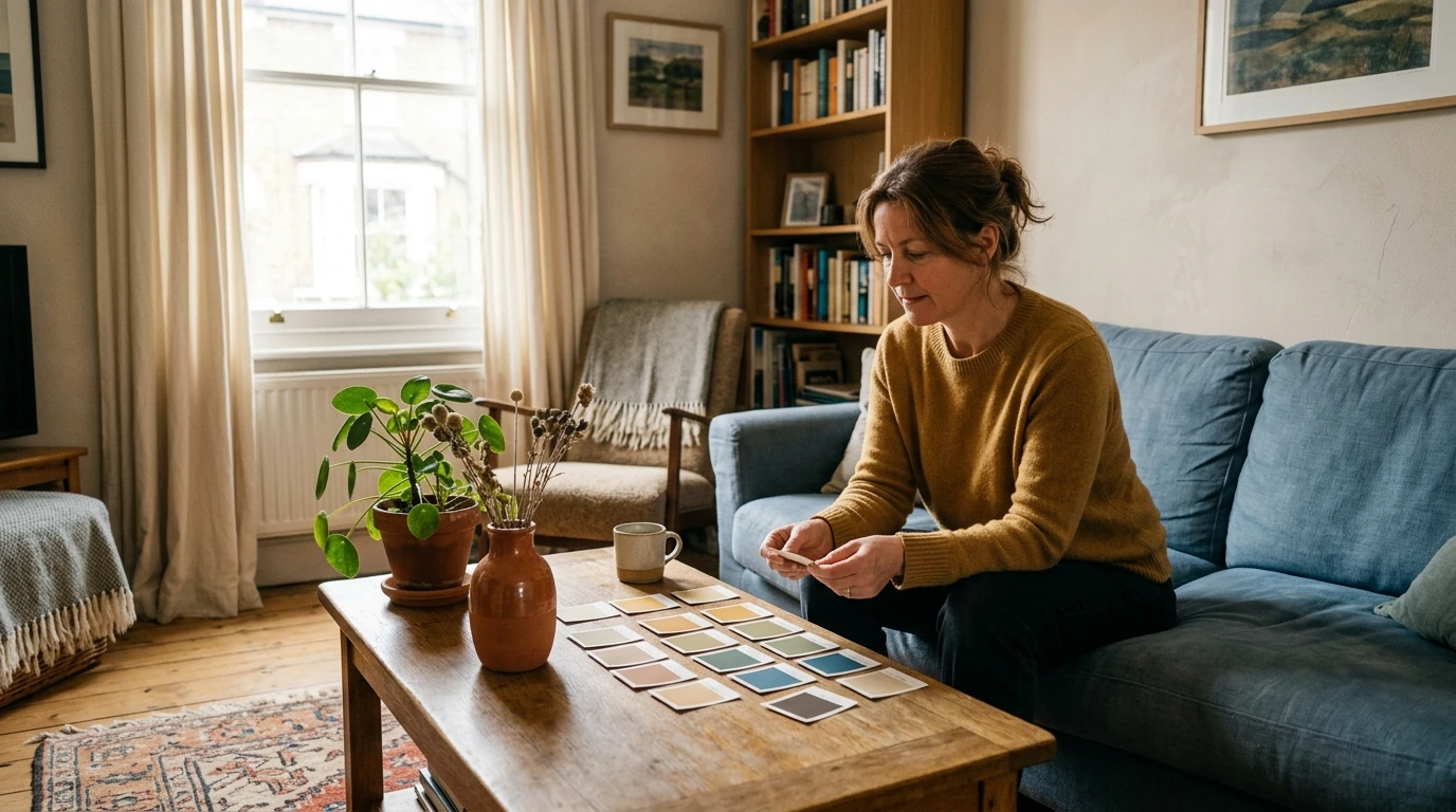
Place paint samples or portable swatches beside the surfaces you plan to keep. Look at them in daylight and after dark: bulbs, window direction, flooring, and nearby colors can all change how a shade appears.
You can start without painting. Try a pillow cover, throw, or other replaceable accent beside your existing furnishings. If you still like the combination in different light, move on to a larger textile or paint sample board before deciding on a whole wall.
Connect rooms without copying them
Your rooms do not need identical palettes. Carrying a familiar neutral or material between spaces can create a connection while leaving room for different accents.
If you want more interior design inspiration, mood-boosting color scheme ideas, and room-by-room decorating tips, our Color Psychology in Home Decorating digital guide is an optional next step. You can also begin today by testing one small palette in one room.
Before choosing, compare the product details with your daily routine, available space, care needs, and preferred setup. The strongest option is usually the one that fits the intended use clearly and remains simple to clean, store, and check before repeat use.
FAQ
What is the 3-5-7 rule in decorating?
Decorators sometimes group accessories in odd numbers, such as three, five, or seven, to create visual variety. It is an arrangement guideline, not a rule about how many colors you may use.
What does each color mean in home?
Blue is often associated with calm, yellow with energy, green with nature, and warm neutrals with coziness. The shade, its surroundings, and your personal preferences can change how any of them feels at home.
What is the 3-color rule in interior design?
It is a way to simplify a palette by choosing a dominant color, a supporting color, and an accent. It does not mean every wood finish, metal, or neutral must count toward a strict limit.
See if Color Psychology in Home Decorating | Digital Guide for Interior Design Inspiration, Mood-Boosting Color Schemes, and Room-by-Room Decorating Tips fits your setup








Leave a comment